Creativity Takes Courage.
Henri Matisse
Where Brands Break Boundaries
At Fynia, we don’t just build brands—we ignite growth, spark engagement, and redefine what’s possible. From branding and packaging to social media and performance marketing, we create strategies that are as daring as they are effective.
Our approach blends creativity with strategy, moving fast from concept to execution while keeping measurable impact at the center. We help ambitious brands evolve, scale, and thrive in a world that never stops changing.

Award-Winning Creativity, Fast-Tracked
In just a few short years, our work has earned multiple GDUSA awards - recognized in 2022, twice in 2023, and twice again in 2024 - for excellence in design and creative impact. This streak reflects our commitment to bold ideas, strategic thinking, and results that don’t just look impressive—they drive growth.
At Fynia, we don’t follow trends; we set them.

What We Do
We help ambitious brands grow, evolve, and stand out through work that blends creativity with performance. From strategy to execution, every service we offer is designed to create impact, spark engagement, and deliver measurable results.
Social Media Strategy & Content Creation
We develop comprehensive social media strategies and execute them end-to-end, including video recording and editing, visual design, and campaign management. Every piece of content is crafted to engage audiences, strengthen your brand identity, and drive measurable growth.

Design is where strategy becomes visible.
Each project begins with a clear intention—to define how a brand is seen, felt, and remembered. From visual identities and editorial layouts to digital experiences, every element is crafted to communicate with precision and timeless appeal across websites, packaging, posters, and trade show environments..


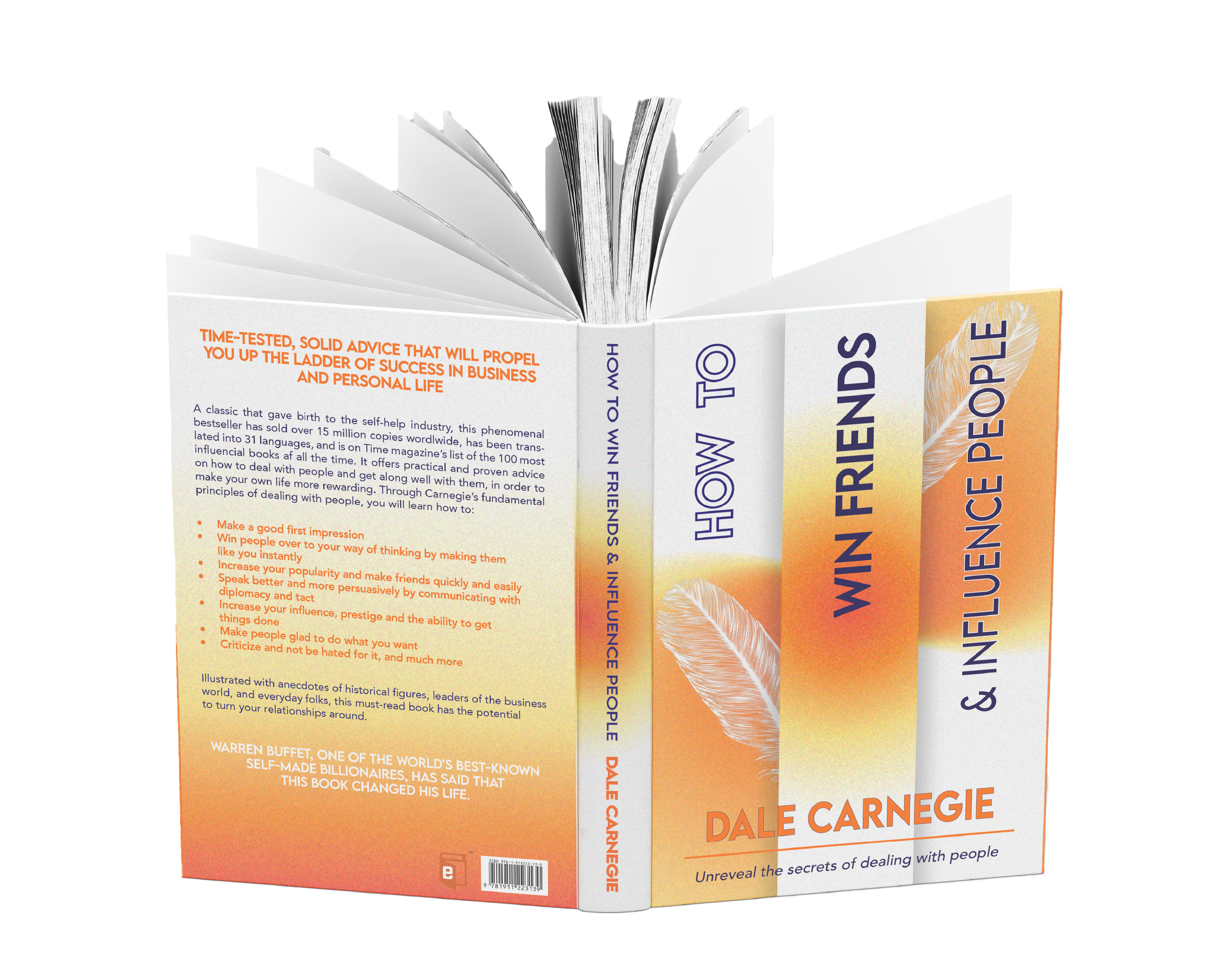


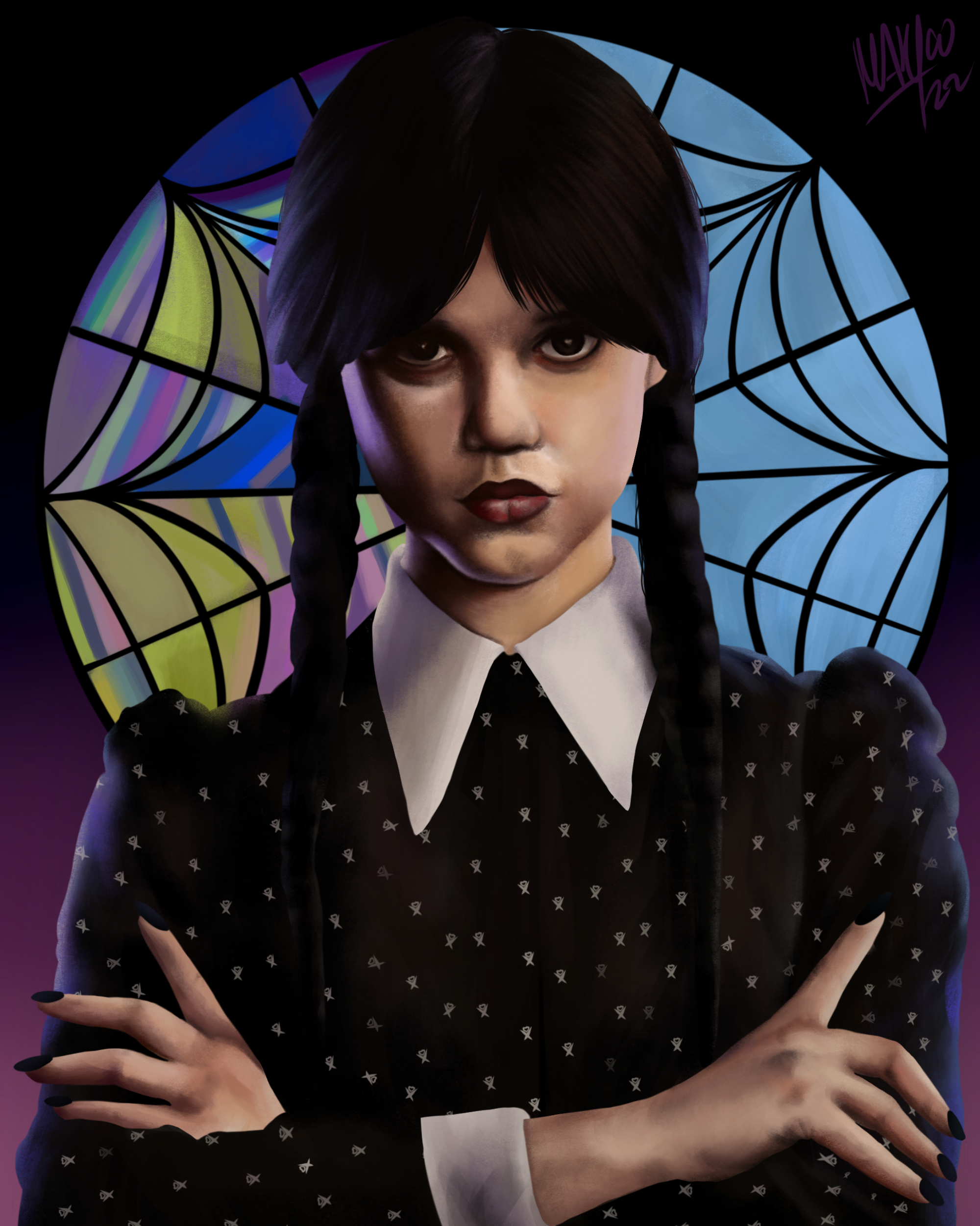
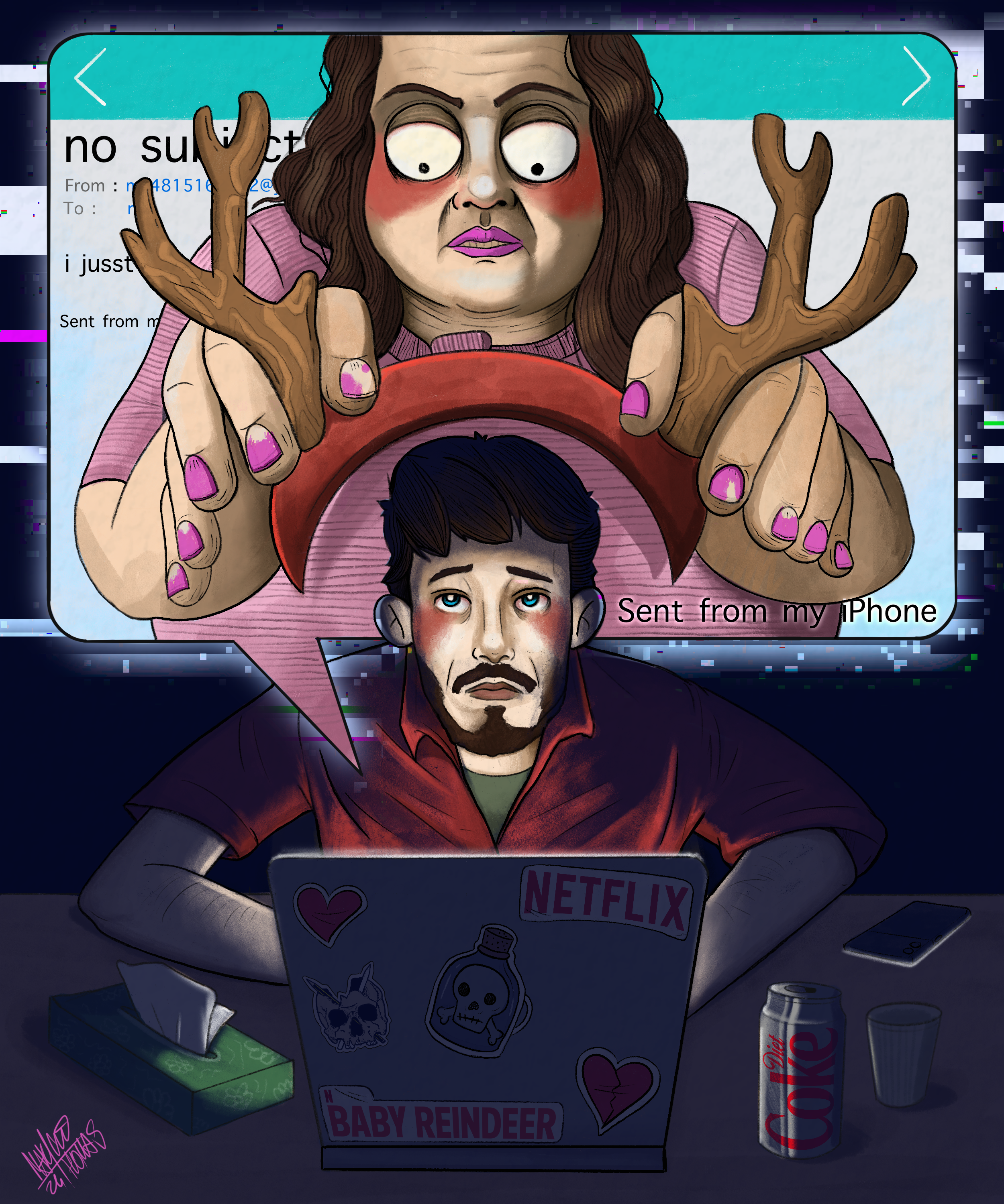
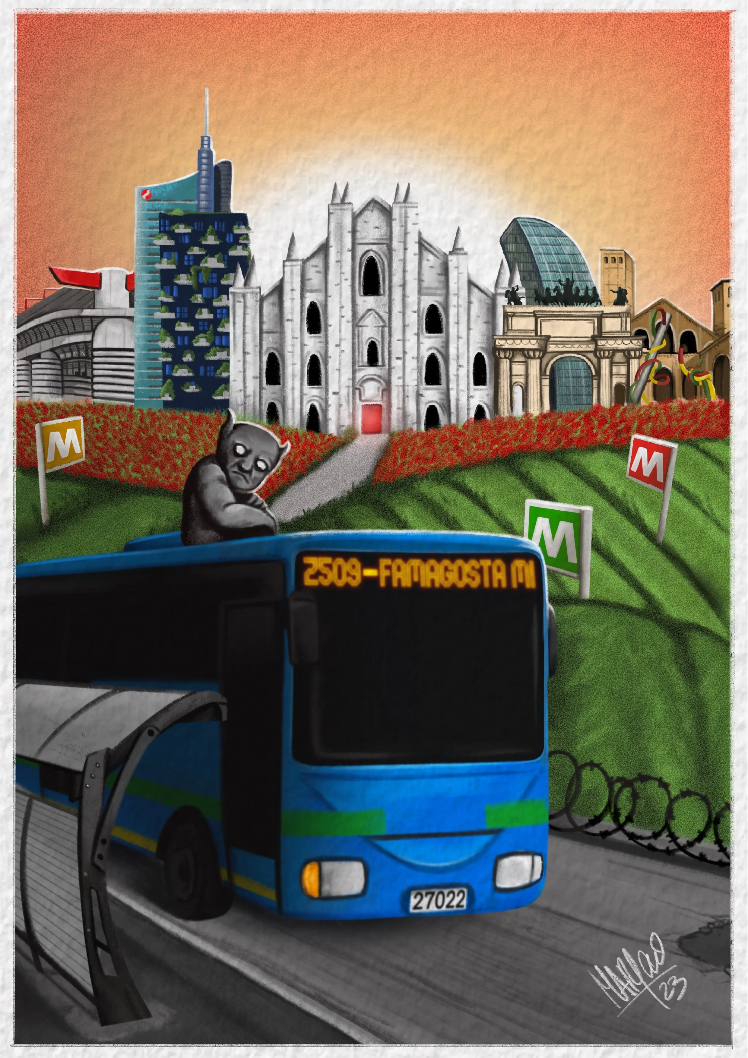
Illustration gives brands a human touch, a way to express ideas with warmth, character, and imagination. Whether for editorial features, campaigns, or bespoke commissions, each piece is created to capture emotion and tell stories that connect beyond words.
Illustration & Visual Art

Contact us.
Every great partnership begins with a simple hello!
Reach out to discuss your goals, your vision, or your next big idea, we’ll take it from there.

